
Inexpensive Usability - 1
August 28, 2023 • Sheetal Malgaonkar
A lot has been written and discussed about usability. Usable solutions or screens with usable features are often considered expensive - the assumption being that they consume a lot of effort and increase overall cost.
Initially, we thought the same. But as we started thinking more like a user, our perspective changed. Through our own mistakes and the design thinking we applied in everyday life, we realized that a simple, user-centric approach can improve user experience without adding to development cost.
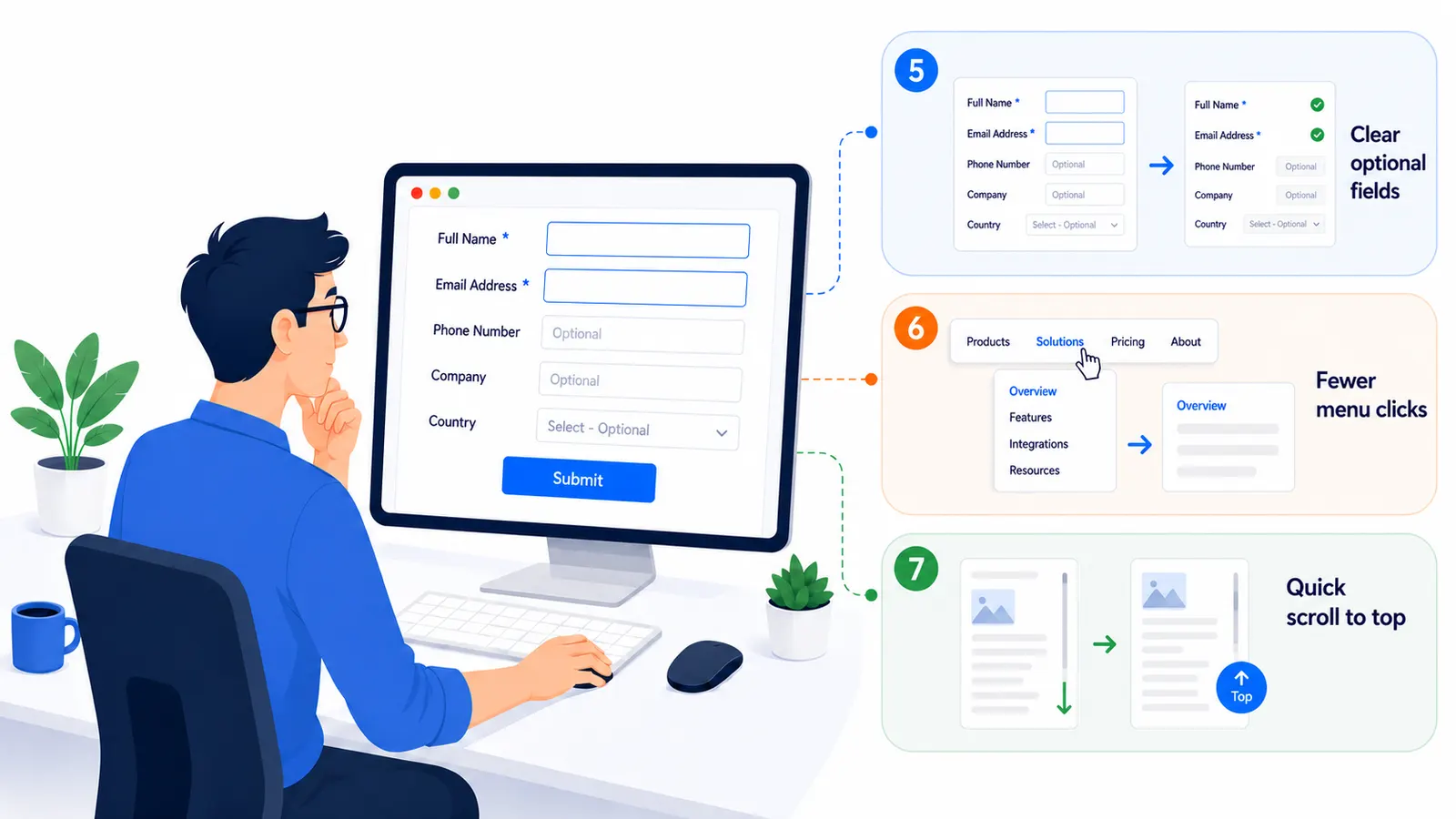
Some examples of our approach are as follows
Scenario 1 - Confusing Form Fields
Users are often unsure what should be entered in a form field, and the order or sequence of fields can add to the confusion - for example, whether a date should be entered as mm/dd/yy or dd/mm/yy.
Our inexpensive approach
- Order & Grouping: set the order of fields in a logical sequence and group related fields together, e.g. address fields.
- Mandatory fields: mark them with an asterisk (*), and add a note at the top of the form explaining that fields marked with * are mandatory.
- Watermark text: add watermark text to optional fields - e.g. a "Landmark" field with the watermark "Optional" tells users it can be left blank.
- A birth date field should show a label with the selected date rather than a free-text box, so users aren't left guessing between dd/mm/yy and mm/dd/yy - a format like "1-Jun-2015" removes the ambiguity entirely.
- A phone number field can use separate boxes for country code, state code, and number, with watermark text like "###" showing the expected digit count.
Scenario 2 - Confusion through Validation
Some data entry screens show only one validation message at a time when the Save button is clicked - the user fixes one field, clicks Save again, and another error appears. This continues until every field is corrected.
Our simple approach
- Inform the user about an error as soon as they move out of that field.
- Show the message near the relevant field, not in a generic alert box.
- Don't reload the whole page during this process.
Scenario 3 - Multiple Submit / Save Attempts
When a Save operation takes time and the user isn't sure it's already in progress, they may click Save again - triggering a duplicate save process, more delay, and potentially duplicate data.
Our simple approach
- Let the user know: change the button label to "Saving..." or "Processing..." on click.
- Avoid re-processing: disable the button to prevent repeat clicks.
- Confirm the action: let the user know once the data has been saved.
Note: since the developer already receives a response confirming whether the save succeeded, showing a "Data Saved Successfully" message doesn't take much extra effort.
We've applied this learning and added it to the standard UI checklist we reference during the development of every screen. It has increased user experience, saved development effort, and reduced support calls. Simple know-how and process can improve usability without impacting development cost - which is what makes usability inexpensive.
More to come in the next part.