
Inexpensive Usability - 2
August 28, 2023 • Sheetal Malgaonkar
Continuing our 'Inexpensive Usability' series, this post covers a few more scenarios that can make a web page more user-friendly without additional development effort.
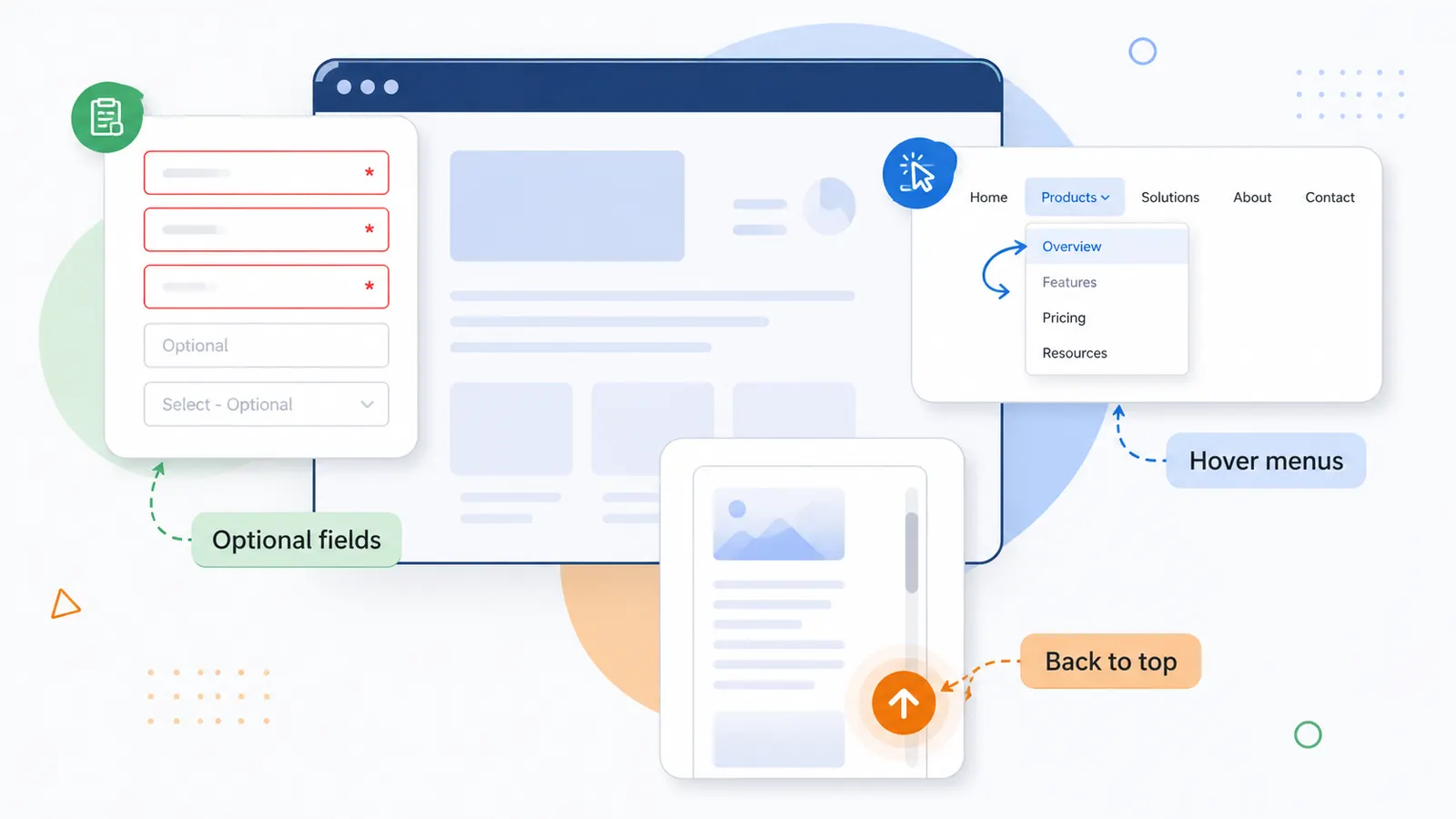
Scenario 5 - Too Many Text Fields
When a form has many fields and it isn't clear which ones are mandatory, users are discouraged from filling it out.
Our inexpensive approach
- For text fields: add watermark text to mark optional fields - e.g. "Address 2" or "Landmark" with the watermark "Optional".
- For dropdowns: change the default option from "Select" to "Select - Optional" to signal it can be skipped.
- For radio buttons / checkboxes: label non-mandatory options as "Optional".
- Additionally, highlight mandatory fields with a different border colour, with a note that red-bordered fields are mandatory.
Scenario 6 - Reduce Menu Clicks
Navigating menus often takes two clicks: one to open the main menu, one to select a sub-menu item.
Our inexpensive approach
- On hover of the main menu, open the sub-menu automatically instead of requiring a click.
- When the main menu itself is clicked, open the page for its first sub-menu item by default.
Scenario 7 - Quick Scroll to Top
On long pages, if navigation links aren't repeated at the bottom, users have to scroll all the way back up just to find them.
Our inexpensive approach: add a "Go to Top" button or an upward arrow near the scrollbar at the bottom of the page.
We've applied this learning and added it to the standard UI checklist we reference during the development of every screen. It has increased user experience, saved development effort, and reduced support calls. Simple know-how and process can improve usability without impacting development cost - which is what makes usability inexpensive.